Better Reading Experience on Follow.it
When you follow a feed (for example in the follow.it directory), you can select “news page” as one of many delivery channels. This allows you to read stories directly in your follow.it account.
We improved the reading experience on the news page in several respects, and those went live today.
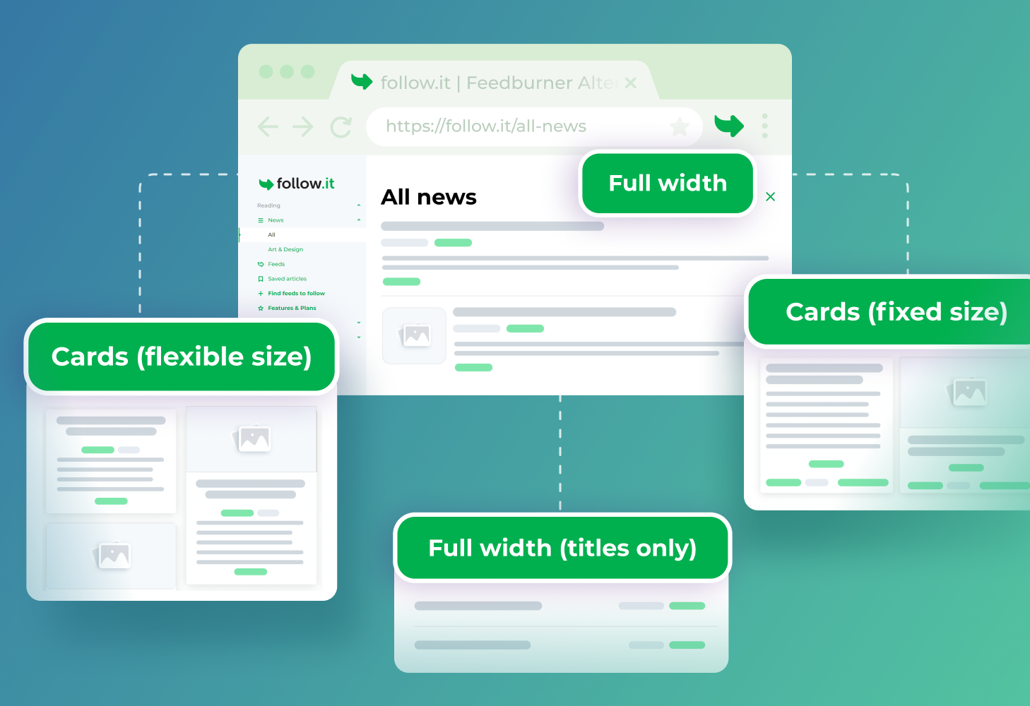
Multiple layout options
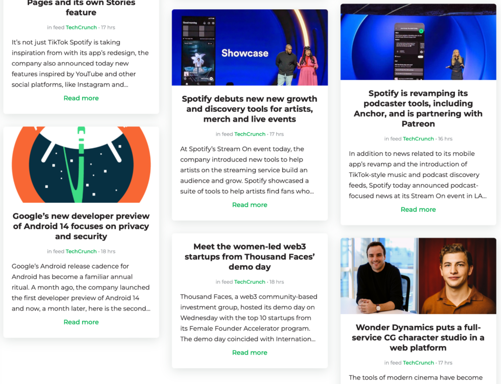
You can now choose from four different “views”. This includes a Cards (flexible size) view where the story containers are dynamic based on their content (e.g., if they have a picture or not):
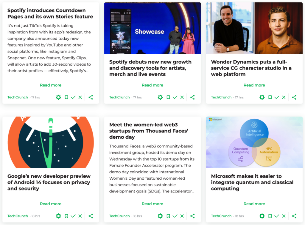
For a more structured look, select the Cards (fixed size) view which, you guessed it, keeps the cards to the same size:
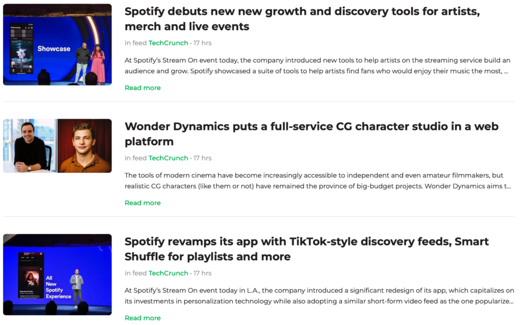
If you’re a fan of a chronological, top-to-bottom reading experience, either go for the Full width view, which shows you stories like this:
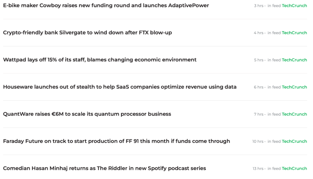
Or, select the Full width (titles only) view if you prefer plain titles without any bells & whistles:
More space for news & smoother navigation
We reduced the size of the navigation bar to provide more space for what matters: the news you want to read.
We also improved navigation in several aspects. For example, clicking on the “News” option takes you straight to your “All News” tab that contains all your news. As before, you can drill down further by selecting specific news categories below it.
Also, we placed the “Find more feeds”-buttons more visibly so that you can quickly get to the follow.it directory where you can follow more feeds.
As before, you can mark stories as read (which hides them) or save them for later reading.
Much more to come
The news page improvements are part of our efforts to make follow.it better for readers. More enhancements to follow soon.
Readers
Follow the news like never before
