New UX & Layout for follow.it
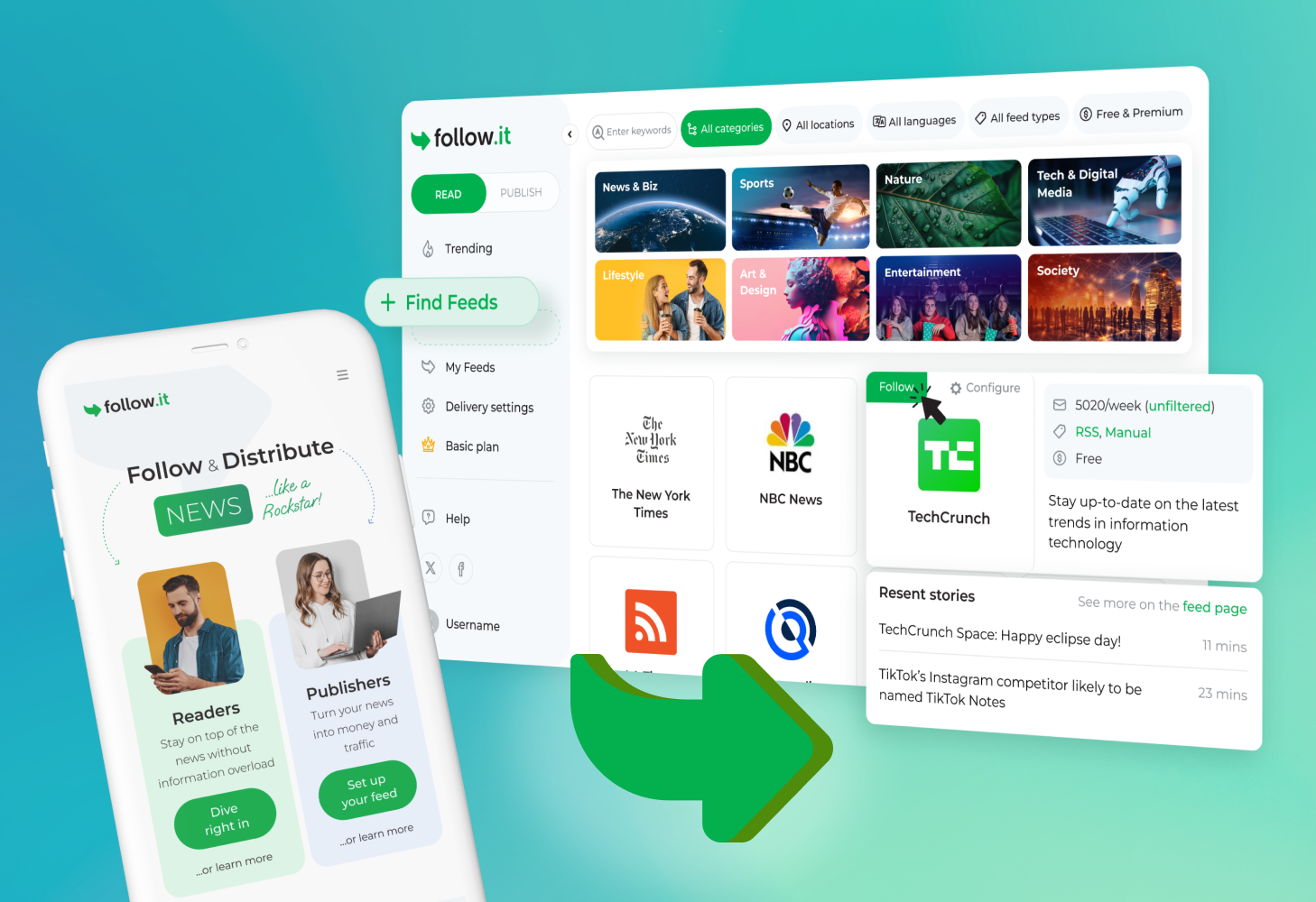
We are excited to announce the launch of a completely overhauled user experience (UX) and layout for follow.it!
What’s New and Why?
The previous design served publishers well who offer their feeds on follow.it. However, as we expand our focus to better serve readers, a fresh layout became essential. Our guiding principle in this redesign was simplicity, catering to readers who seek a straightforward, easy-to-use tool for finding feeds and receiving news.
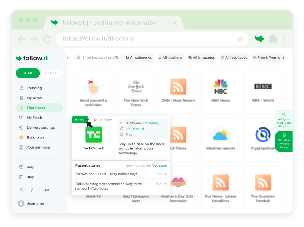
Finding feeds is now more intuitive with our redesigned feed directory. Browsing and selecting feeds is a breeze, making it easier for readers to discover and follow their favorite content.
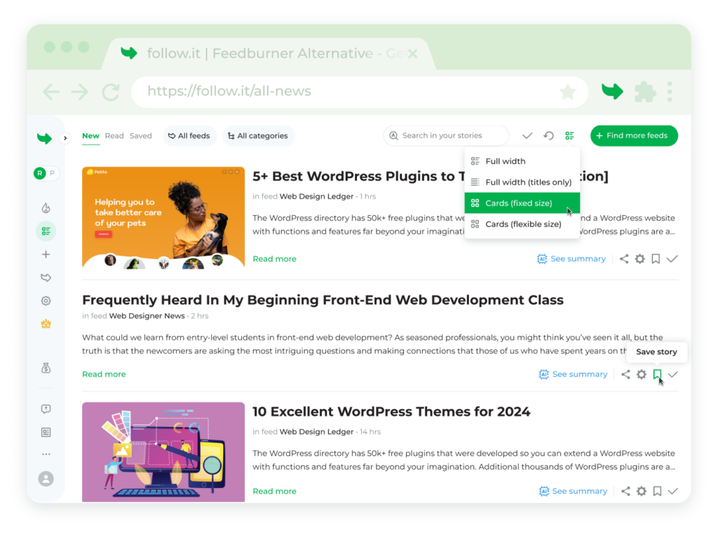
Also, we’ve significantly upgraded the reading experience. Building on previous enhancements, the new layout allows for faster reading and efficient story management. Readers can now mark stories as read and save their favorite stories with ease.
What’s Next?
This new design lays the foundation for future improvements to both readers and publishers. Upcoming features include expanded API feed offerings, additional delivery channels, and much more. Stay tuned and follow our blog to keep up with the latest developments!
Readers
Follow the news like never before

